1950s Bathroom Ideas for a Pastel Bath That Feels Grown-Up
1950s bathroom ideas that keep a pink, mint or powder blue bath looking grown-up: one color family, the trim band, matching fixtures, real towels, and how to decide between keeping the original tile and replacing it.

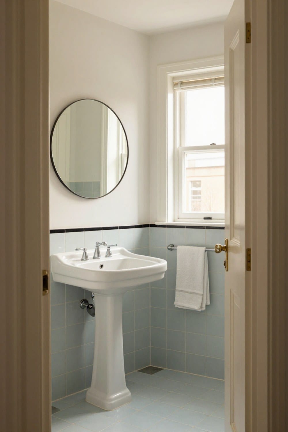
1950s bathroom ideas usually begin with a color you can't quite decide about: a pink, a mint or a powder blue that somebody chose seventy years ago and nobody since has had the nerve to change. Here's the good news. The color is almost never the problem.
Ours is powder blue. The previous owners redid the hall bath in the mid 1950s, and when we moved in I wanted it gone by spring. Four years later it's the room guests ask about. The tile didn't change. What changed was how much else I let into the room.
A pastel bath goes wrong in one particular way. It gets cute. Add a matching rug, a matching soap pump and a shower curtain covered in little ducks, and a good room turns into a set piece. This guide is about keeping it grown-up: one color family, quiet walls, real towels and fewer things. You'll also get the keep-or-replace question, and what to do when one cracked tile needs a match.
What a 1950s bathroom really looked like
Postwar houses went up fast, and the bathroom became the one room where color was allowed to show off. The classic recipe is glazed ceramic wall tile, often in 4 1/4 inch squares, run up the wall to somewhere around four or five feet. Above it, painted plaster or a quiet wallpaper.
The fixtures were often sold as a suite, so the tub, toilet and sink matched each other and the tile. Faucets were polished chrome with plain cross or lever handles. Ceramic soap dishes and toothbrush holders were set right into the wall tile, and the vanity was frequently a built-in cabinet with a laminate or tile top.
Pink gets the headlines, but the real range was wider: mint green, powder blue, butter yellow, soft gray, and a charcoal or black used as an accent. Pam Kueber of Retro Renovation started Save the Pink Bathrooms years ago because so many of these rooms were being torn out. If yours is pink, how to decorate a pink tile bathroom goes deeper on that one color. For a quick look at how this decade fits between the others, the decade-by-decade guide to retro bathroom styles lays it out.
1950s bathroom ideas start with one color family
The tile is the star, so it sets the temperature for everything else. Decide what family it belongs to, then pick the supporting colors from that same family or from a warm neutral.
- Pink: warm white, cream and a blush that sits slightly deeper than the tile. Chrome, never a cool silver.
- Mint: soft cream and a touch of gray-green. It leans toward green, so the green tile bathroom ideas guide applies here too.
- Powder blue: warm white and pale gray, with a bit of cream to keep it from going icy.
- Butter yellow: warm white and oatmeal. It takes a deeper trim band better than most colors.
- Gray: the most flexible. It can carry a brighter accent, and a dusty pink or green towel looks wonderful against it.
I learned the warm-neutral rule the hard way. I painted the wall above our blue tile a stark, bright white first. It made the blue look dingy and a little cold, like a swimming pool in October. A warm white in the same room looked like a different tile entirely. Test any sample against the tile in morning and dusk light; the vintage bathroom paint colors guide has the full approach.
The trim band is doing more than you think
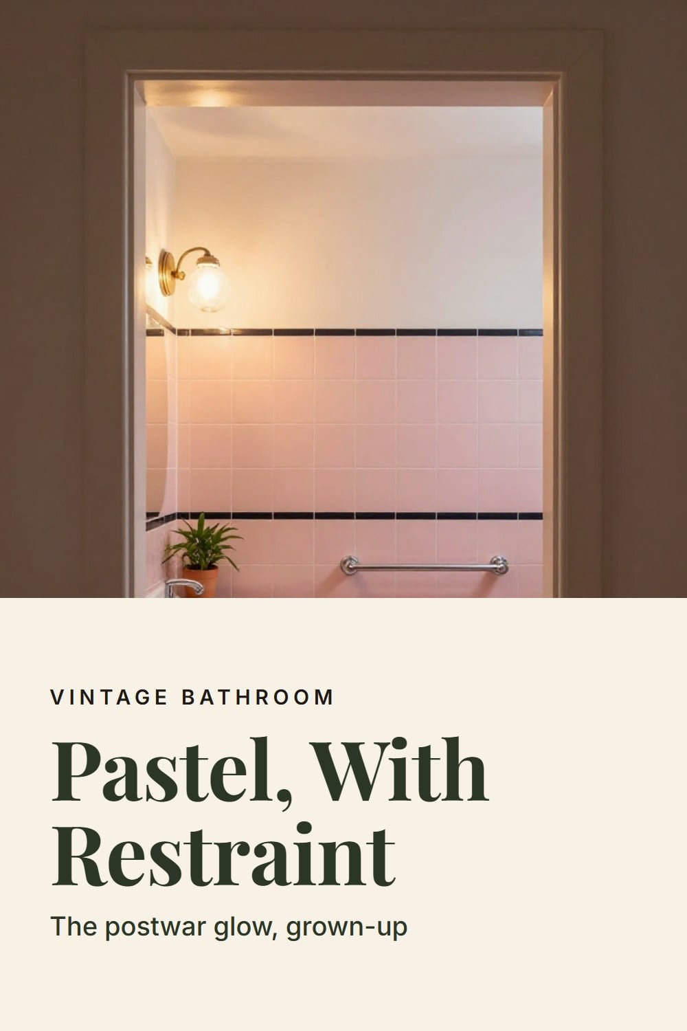
Look closely at a good 1950s bath and you'll find a single row of tile in a contrasting color, usually black, charcoal or a much deeper shade of the main color. Sometimes it sits at the top of the wainscot. Sometimes it caps the tub surround. The rounded edge piece along it is called a bullnose.
That one line is why the room looks designed. Without it, a field of pink or blue is just a lot of pink or blue. With it, the eye gets a horizon, and the pastel suddenly reads as deliberate.
Here's the trick I'd borrow. Echo the band once, somewhere else in the room, and then stop. A black picture frame, a dark cabinet pull, a thin stripe on a hand towel. Adding a second contrast color is what turns a nice bath into a busy one.
I'll admit that I once looked at our own band, a charcoal row about four inches tall, and considered painting over it to calm the room down. I'm glad I didn't. Take that band out and the whole wall loses its structure.
Fixtures, chrome and the built-in vanity
A colored tub, toilet and sink that match the tile are the most distinctive part of the era, and the hardest to replace. If they're in decent shape, they're worth keeping as a set. Mixed colors look accidental. A single white replacement beside blue fixtures shows from the doorway.
If you must replace one piece, choose the warmest white you can find and let the tile stay the lead color. A white pedestal sink in a pastel bath looks calm and intentional, and the old eye-catching color stays where it belongs, on the wall.
Keep the metal consistent. Polished chrome with plain cross or lever handles is right for the decade, and mixing in brass or black fights the trim band. For older faucets and taps with a longer story, cross handle bathroom faucets explains what ages well.
The built-in vanity is usually a plain box in birch or maple with a flat door. Painted a warm white or a deeper shade of the tile color, it looks fresh and still belongs. Keep the original pulls if you can. Vintage bathroom vanity ideas covers the other routes.
And please use the recessed soap dish and toothbrush holder. A bar of soap sitting in that little ceramic niche is the best accessory in the room, and it's already installed.
Keep the original tile or replace it?
My answer is keep it, unless the room tells you otherwise. Tile from this period is thick, well set and finished in a glaze that has survived seven decades. New tile in a 1950s house almost never matches the old color, and the color is the character.
Here's how to tell. Tap across the wall with a knuckle or a spoon handle. A solid, dull tap means the tile is bonded. A hollow, drummy sound means it has let go of the wall. Look at the glaze too. Fine hairline crazing is normal for the age. Wide cracks, chips down to the clay and stains that follow a grout line are not.
How to match tile when a few pieces are gone
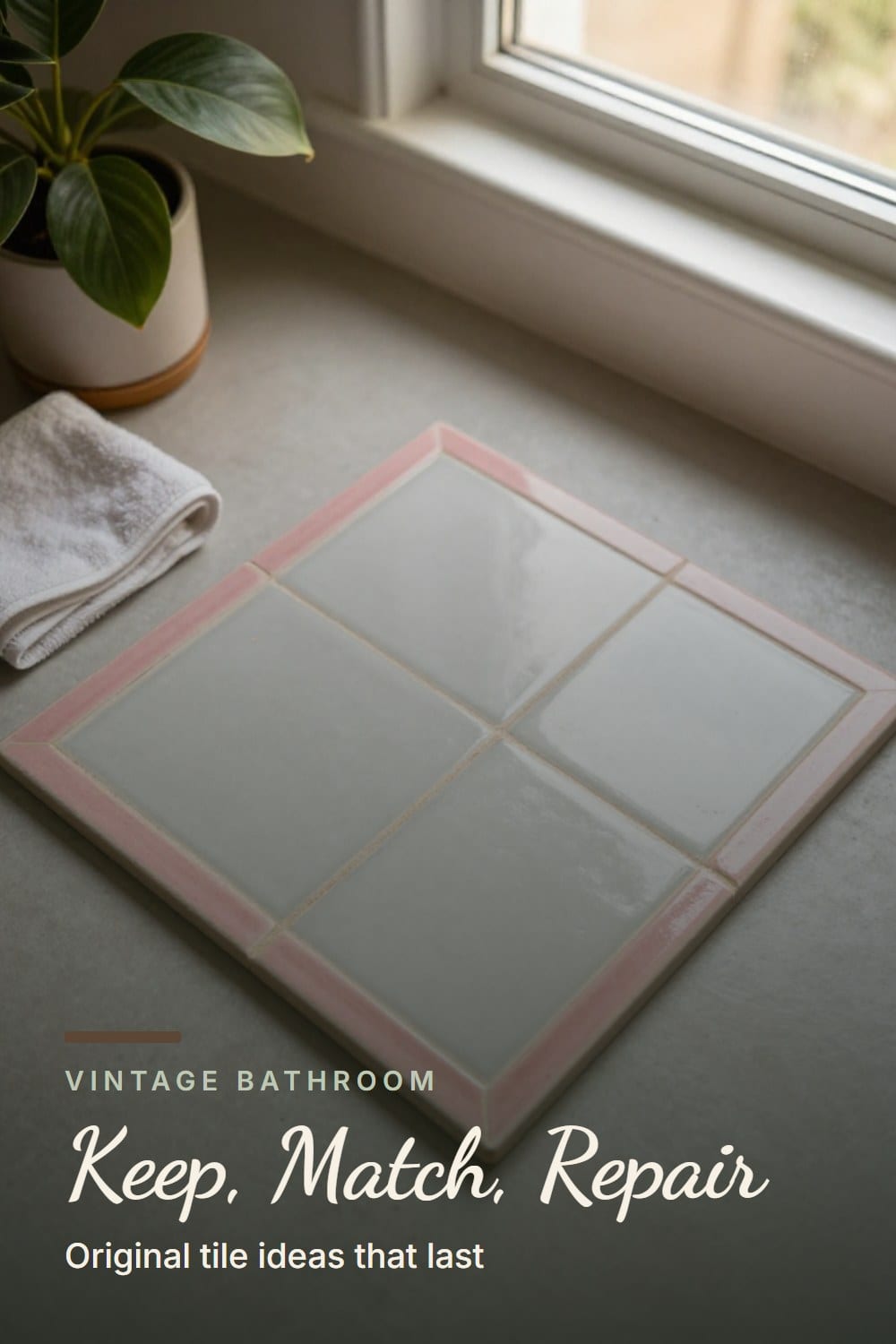
Cracked or missing tile is the usual reason people give up on the original. It doesn't have to be. Start with the loose piece itself and a daylight photo, and measure the real size. A great deal of this tile is 4 1/4 inch, and a 4 inch replacement will leave visible gaps.
Then work through the sources in this order.
- Look in the house first. Tiles hiding behind the old medicine cabinet, inside a closet that shares the wall or under the tub apron are the same batch and the same age.
- Check architectural salvage. Reclaimed tile in 1950s colors turns up at salvage yards and in online listings, and sellers often photograph it in daylight.
- Ask about a custom glaze match. A few tile makers will match a glaze to a sample you mail them. Expect it to land close rather than identical, and expect a wait.
- Place the new piece where it's least seen. A low corner behind the door beats the eye level wall by the mirror.
- Match the grout, not just the tile. Joints narrower than about 1/8 inch take unsanded grout. Test the shade on a hidden spot and let it cure fully, which usually takes a day or two.
Our own repair was one chipped tile beside the tub. The salvage piece was a hair lighter than ours, so I put it in the corner behind the door. Four years on, I'd have to look hard to find it. For the wider tile conversation, vintage bathroom tile ideas has the patterns and colors that last.
Walls, towels and the rule of fewer things
Above the tile, keep the walls quiet. A warm white or a soft cream in an eggshell or satin finish is easy to wipe and easy on the eye. If you want pattern, a small tonal wallpaper above the tile line is lovely, as long as the fan keeps up with the steam. Vintage bathroom wallpaper ideas covers how to make it last.
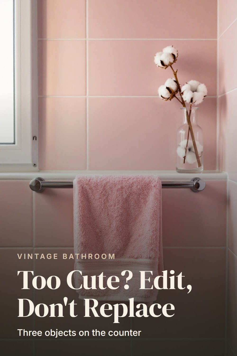
Towels are where most of the color gets added back, so choose them carefully. Go tonal: a shade deeper or a shade lighter than the tile, or a warm white with a narrow stripe. Heavy cotton towels around 600 GSM feel substantial and hang straight on a chrome bar. Thin ones look worn after a month.
Then set a limit. My rule is three objects on the counter. Mine are a soap dish, a clear glass jar of cotton balls and a sprig of eucalyptus in a small vase. Everything else lives in the vanity. A pastel bath looks calm when the surfaces are clear, and cluttered fast when they're not. The vintage bathroom decor guide goes through the finishing pieces that earn their place.
Why a pastel bath tips into kitsch
I've made most of these mistakes, so I can name them. If your 1950s bath feels more theme park than home, one of these is almost certainly the reason.
- Matching every accessory to the tile. The rug, the soap pump and the wastebasket in the same pink. Fix it by repeating the color once and letting the rest be warm white.
- Two pastels at the same strength. Mint tile with a lavender curtain competes with itself. Choose one pastel and let the other be a muted neutral.
- Novelty decor. Flamingos, fish and cartoon figures turn a real period bath into a costume. A framed print in a plain frame does the same job quietly.
- Stark white walls. They make pastel tile look chalky. Switch to a warm white and the whole room softens.
- Every period reproduction at once. Pick two details that suit the decade and stop there.
Light, mirrors and the finishing details
Light matters more in a pastel bath than anywhere else. Cool bulbs around 4000K turn pink salmon and blue gray. Use warm bulbs at about 2700K with a CRI of 90 or higher, and the colors look rich and soft the way they did in the photographs that made you fall for this look.
A pair of glass globe sconces beside the mirror, or a simple bar light above it, suits the era. Anything over the tub or shower has to be damp- or wet-rated, and rewiring a vintage fixture is an electrician's job. Vintage bathroom lighting explains the options.
If your house is a ranch from the same decade
A lot of these baths live in 1950s and 60s houses, where the rest of the rooms lean mid century. If that's yours, the mid century bathroom ideas guide pairs well with this one, especially for vanity lines and lighting.
And if your house is older or newer and you only want the feeling, how to make a bathroom look vintage shows how to borrow it without a renovation. For something a generation earlier, 1920s bathroom ideas goes the white hex and nickel route instead.
A keep-or-replace checklist before you start
- Tap the tile and listen for hollow sounds.
- Check the glaze for wide cracks and chips down to the clay.
- Look for stains or soft spots along the grout and tub edge.
- Have old adhesive, floor tile and paint tested before any demolition or sanding.
- Note the real tile size in inches before you shop for matches.
- Decide on your one color family and one trim band echo.
- Swap in 2700K bulbs and clear the counter to three objects.
My advice is to live in the room for a month before you decide anything big. Change the bulbs, fold the towels, clear the counter, and see what's left to fix. Usually it's less than you thought. For the full old-house picture, the complete guide to a vintage bathroom that lasts ties it together.
The Pastel Bath Pairing Sheet
The printable is being finished. It will live here, free, with no sign-up wall.
Frequently asked
What colors go with a 1950s pastel bathroom?
Should I keep my 1950s bathroom tile?
How do I stop a pastel bathroom from looking kitschy?
Where can I find tile to match my vintage bathroom?
Sarah Whitmore
she keeps the teak, she oils it in spring
Sarah has furnished the same porch three times and finally stopped. She writes about what actually survives a decade outdoors — which wood silvers, which fabric fades, and which inexpensive piece quietly reads the same as the expensive one.
SarahMore from this corner
 Vintage Bathroom
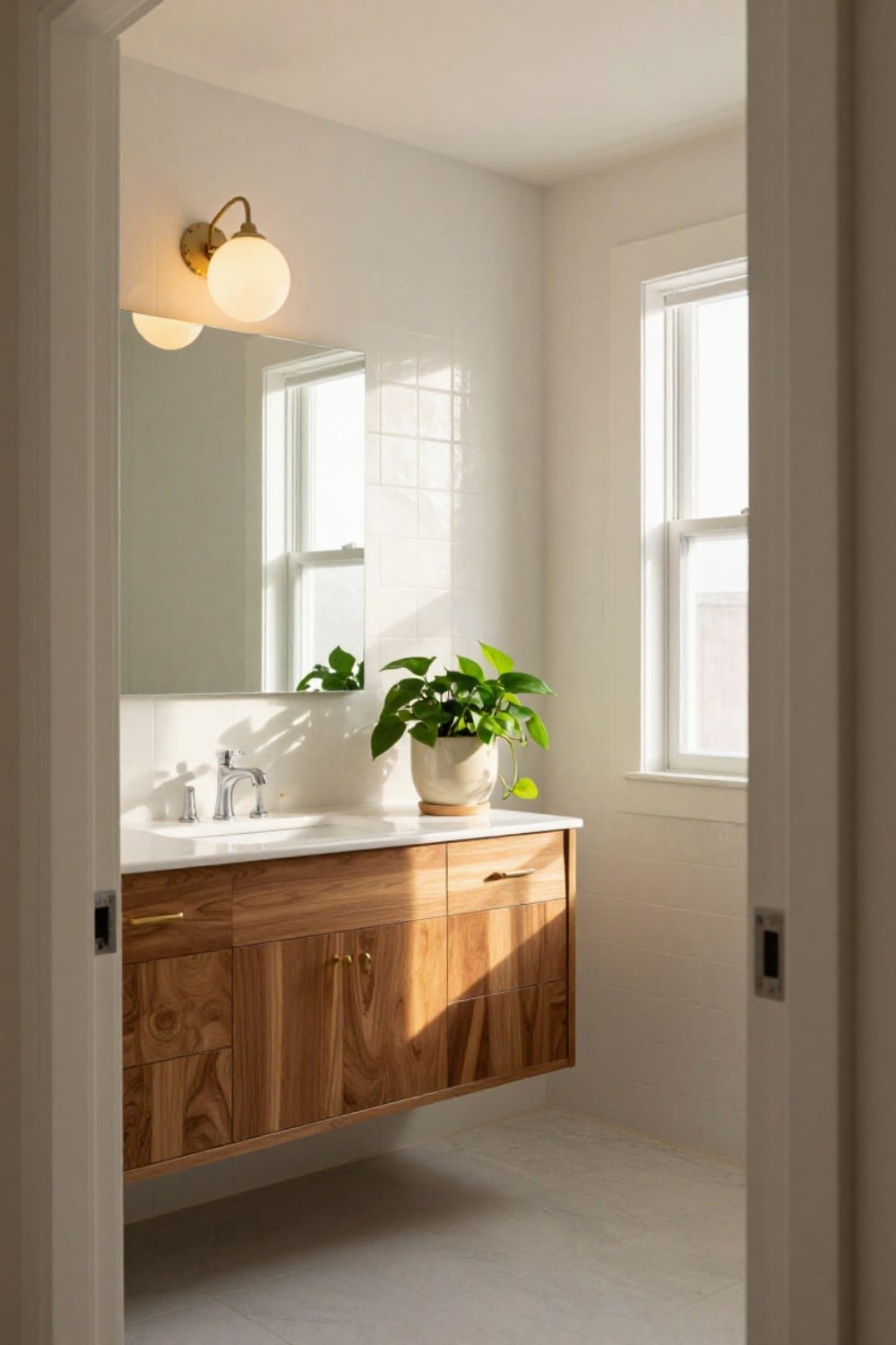
Mid Century Bathroom Ideas for a House Built in the 1950s and 60s
Mid century bathroom ideas for a ranch or split-level: the floating vanity, square and penny tile, globe lights, a wide mirror, and which original features to keep and update around.
Oct 31, 2026 · 12 min read
 Vintage Bathroom
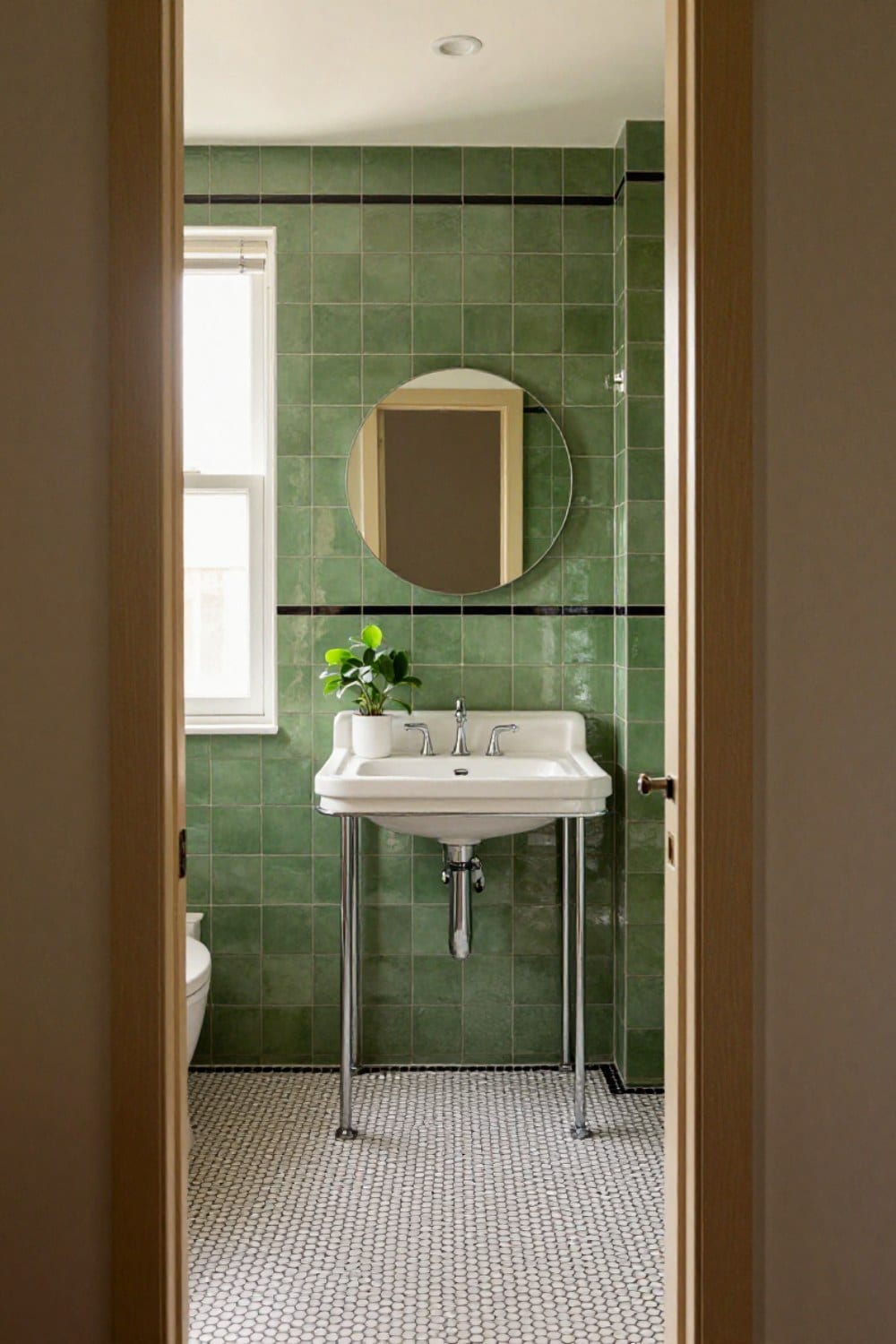
Art Deco Bathroom Ideas That Feel Classic, Not Costume
Art deco bathroom ideas scaled for a real house: the one-statement rule, black and white or green and black tile with a border, round mirrors, frosted sconces, a console sink on chrome legs, and the mistakes that make it look like a set.
Oct 31, 2026 · 11 min read
 Vintage Bathroom
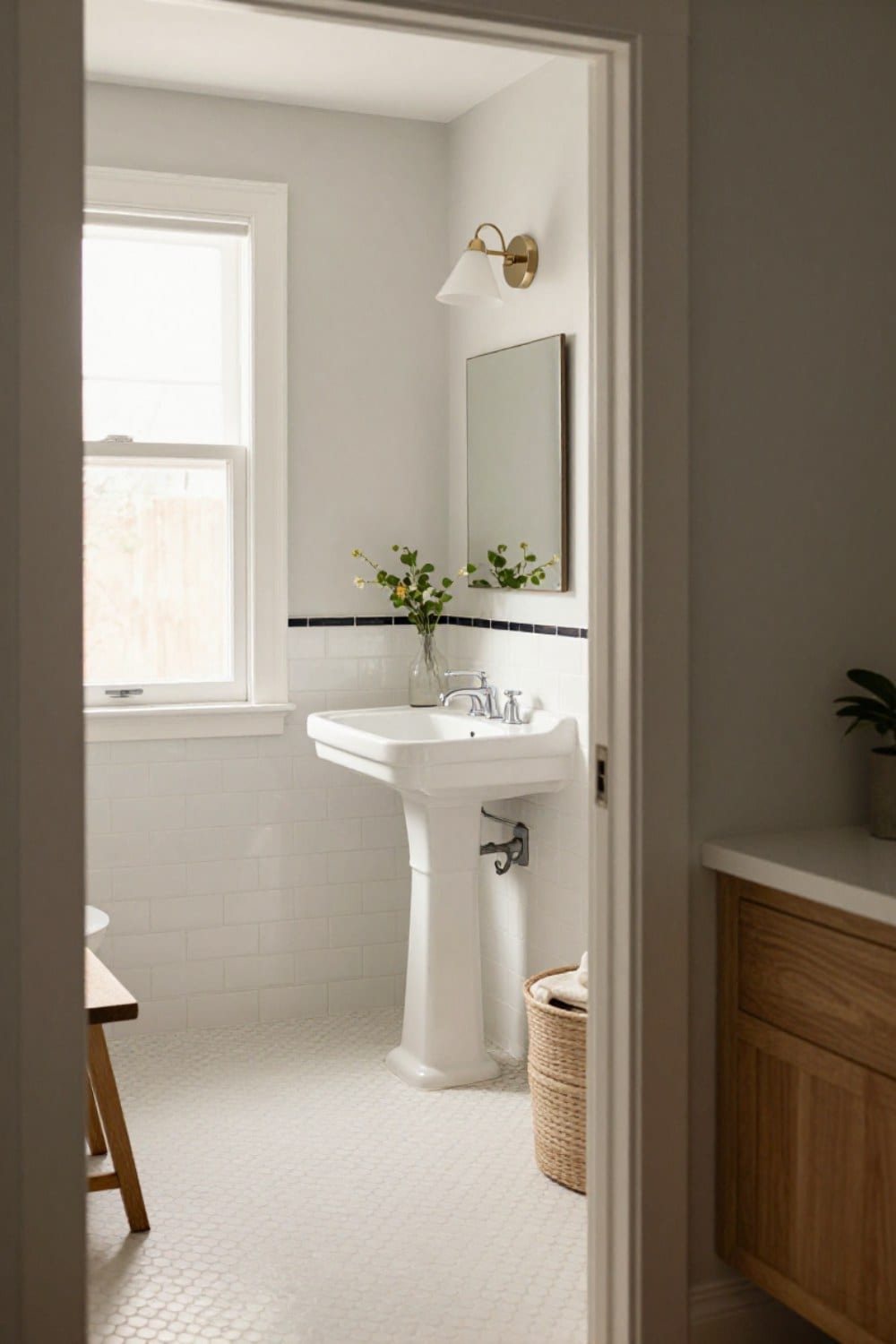
 Tile Ideas: The Patterns and Colors That Never Date
Vintage bathroom tile ideas that still look right decades on: the hex, penny, subway and checkerboard patterns, the glaze colors worth keeping, the grout rule that matters most, and how to decide between repair and reproduction.
Oct 29, 2026 · 12 min read