Vintage Bathroom Paint Colors That Work With Old Tile
Vintage bathroom paint colors matched to the tile you already have: eleven pairings for pink, mint, yellow, powder blue, black and white and plain subway, plus the right finish, the ceiling shade and how to test in your own light.

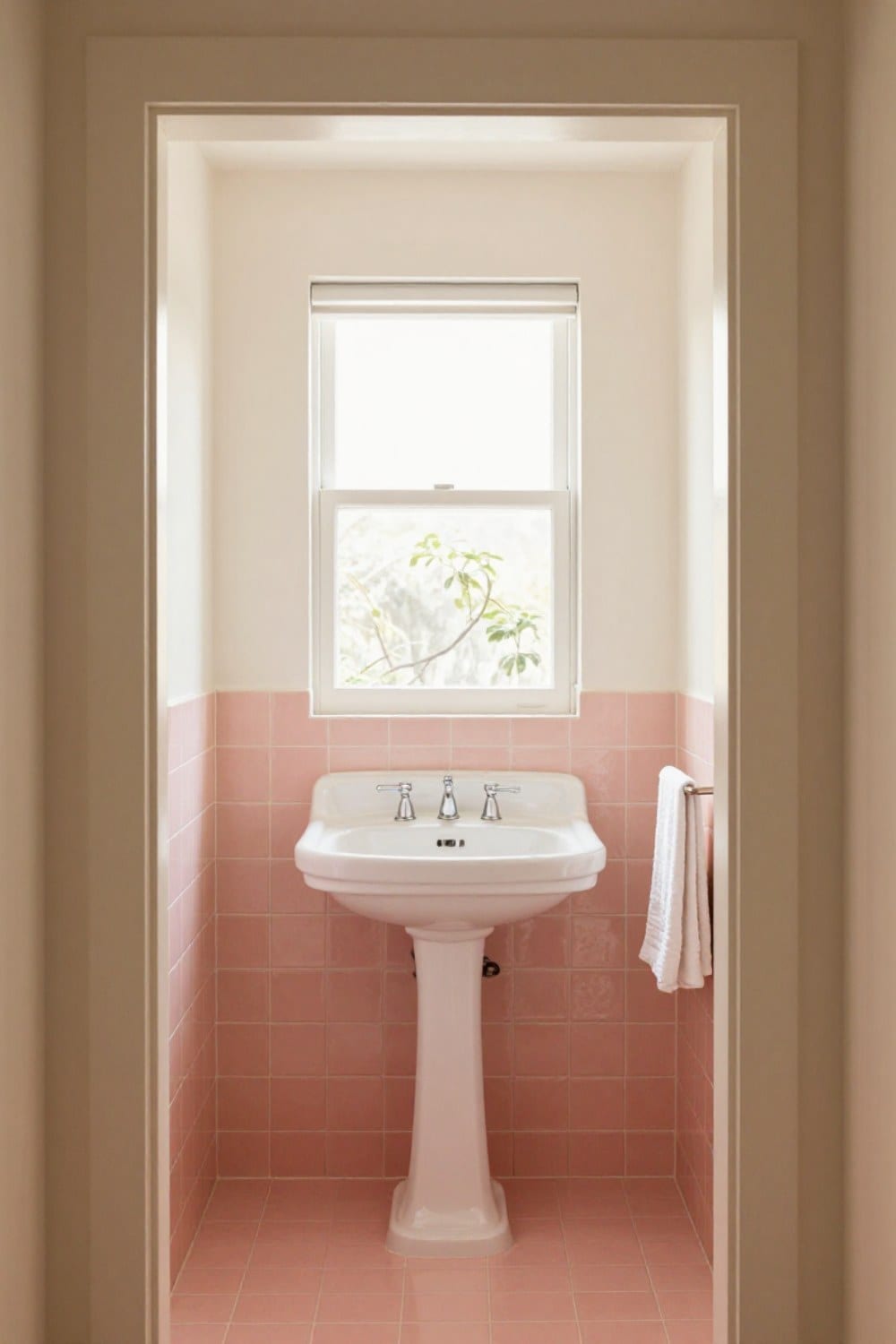
Vintage bathroom paint colors are a different puzzle from ordinary bathroom paint, because the tile got there first and it isn't going anywhere. Your walls have to get along with a pink, a mint or a butter yellow that somebody chose in 1952, and the wrong white can make that tile look tired overnight.
I know, because I painted the wall above our mint tile a stark white first. It made the tile look green-gray and a little sad. I stood in the doorway holding a roller and felt the whole room go flat. Two coats later, I started over.
This guide is organized by the tile you actually have. You'll find eleven pairings across pink, mint, yellow, powder blue, black and white, and plain subway, then the finish to use, the ceiling shade that quietly helps, and how to test a color before you commit. I'm staying in color families on purpose. A can of any paint will look different in your light, so the family matters more than the name on the lid.
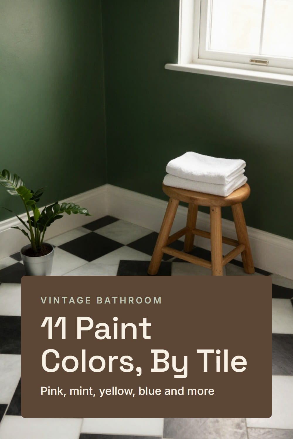
Start with the tile's undertone, not the paint chip
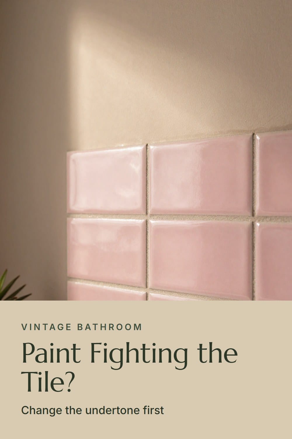
Old glaze isn't one flat color. A 1950s pink can lean peach or lean toward lilac. A mint can swing blue or swing yellow. Whatever the tile leans toward is its undertone, and the wall color either flatters it or fights it.
Here's the easiest way to see it. Hold a sheet of plain white printer paper flat against the tile in daylight. Next to that clean white, the tile will suddenly look warm or cool. You can't unsee it once you've done this.
From there you have three moves. You can match the undertone with a quieter version, so the tile stays the star. You can go deeper in the same family, so the walls frame the tile. Or you can set it against a deliberate contrast, like ink blue behind yellow. My rule is short: match the undertone, then go quieter or deeper.
If you're still deciding what to keep and what to replace, vintage bathroom tile ideas covers the patterns and colors that hold up, and it's worth a read before any paint goes on.
Vintage bathroom paint colors for pink tile
Pink tile is the one people are most nervous about, and it's the one I'd defend the hardest. Pink is flattering, it glows in lamplight, and it asks for restraint from everything around it. The full story on keeping it is in how to decorate a pink tile bathroom. These are the walls I'd pair with it.
Warm white with a little cream in it
A soft, creamy white keeps pink looking like a glaze instead of a statement. It lets the tile be the only color, which is how a 1950s bath looked when it was new. Stark, bright white does the opposite and turns a gentle pink into bubble gum.
Mushroom
Mushroom is a gray-brown with warmth underneath. Beside pink it takes out the sweetness and makes the room feel grown up, especially with polished nickel fittings. It's the pairing I'd choose if you're worried the pink will look too girlish.
Burgundy
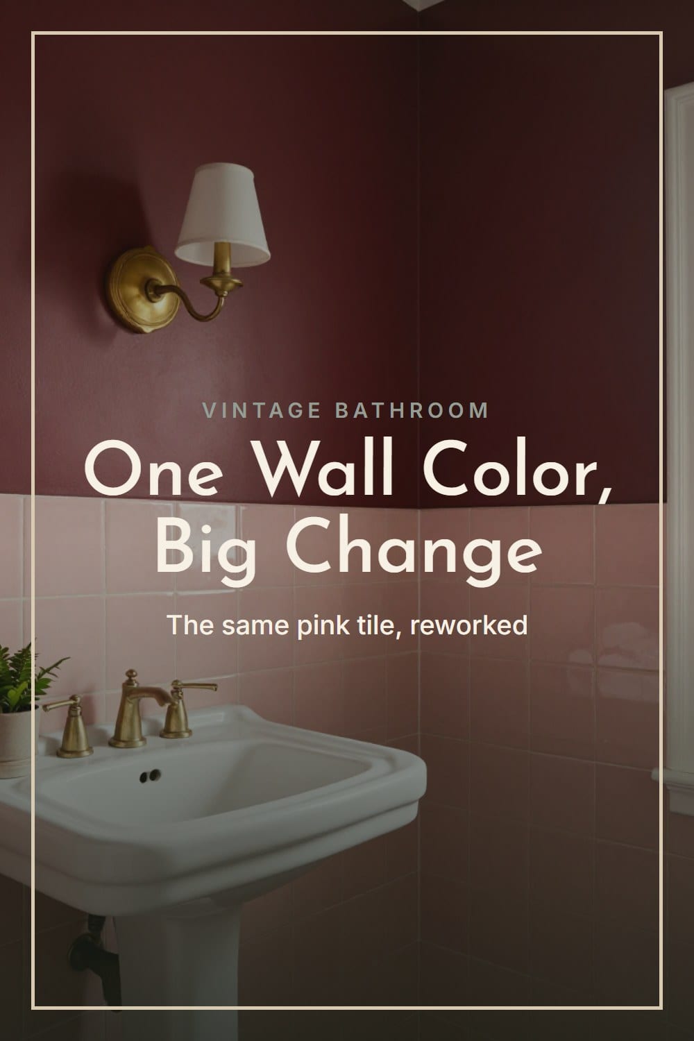
Deep wine red above a dusty pink is moody and surprisingly old-fashioned in the best way. It works best with a muted, slightly gray pink rather than a bright one, and with warm bulbs at 2700K. Dark walls show every brush stroke, so use good light while you paint. The moody vintage bathroom guide shows how far you can take the idea.
Paint colors for mint and green tile
Mint tile has the same trouble as pink: it can look sugary or it can look serene, and the wall decides. If your tile is a deeper green, the longer rundown in green tile bathroom ideas goes through mint, sage and bottle green.
Putty
Putty is a yellowed, slightly gray beige. It warms mint without fighting it, and it keeps the tile from reading cold. This is what I ended up with after the stark white mistake, and it has outlasted two lighting changes.
Soft blush
Mint with a pale blush is a classic mid century pairing, and the trick is keeping the blush barely there. Think of the inside of a shell, not a candy box. It looks especially right beside chrome and white fixtures. For the whole look, see 1950s bathroom ideas.
Paint colors for yellow tile
Yellow tile has a bad reputation, and mostly it's the walls' fault. Warm beige and harvest tones pile onto it and make the room feel like a dated kitchen. Go cooler or go quieter.
Ink blue
Ink blue is a dark blue with a bit of black in it. Behind butter yellow tile it makes the yellow glow like old brass. Because both colors are rich, keep everything else plain: white towels, a white pedestal sink, nickel.
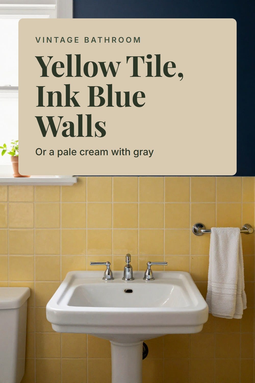
Pale cream with a drop of gray
If dark walls feel like too much, choose a pale cream that has a little gray in it. Pure warm cream next to yellow tile reads like lemon custard. The gray steadies it, and the tile stops looking like the loudest thing in the house.
Paint colors for powder blue tile
Powder blue is cool, and cool next to cool can feel like a locker room. The fix is warmth.
Warm sand
A soft sand, somewhere between beige and greige, makes powder blue look fresh instead of chilly. Add a brass or aged nickel sconce and you have a room that feels like a seaside house in 1958. I'd skip gray here, because gray plus blue is how you get the locker room.
Paint colors for black and white tile
Black and white tile is a graphic, high-contrast surface, and the wall's job is to soften it. Plain white walls above a checkerboard floor can feel stark, like a diner.
Deep green
A deep bottle green with some black in it settles the contrast. It makes the white tile look creamier and the black look softer, and it sits happily with brass. If you want the full approach, the black and white tile bathroom guide is about making that tile feel warm, and the checkerboard floor ideas cover the floor itself.
Paint colors for plain white subway tile
White subway tile is the easiest tile to paint around and the easiest to get wrong, because everything seems fine and nothing guides you. Treat it as a neutral that wants one confident choice.
Sage
A gray-green sage above 3x6 white subway is quiet and permanent. It never looks like a trend, and it's kind to older plaster that isn't flawless. Choose one with a touch of yellow so it stays warm in winter light.
Soft clay
A muted clay, a pinkish earth tone, turns white subway into something that looks collected. It reads old-world with aged brass and linen towels. Keep it dusty, because a bright terracotta tips into costume.
The ceiling color secret for old baths
Most old bathrooms have a low-ish ceiling and not much window. A white ceiling can feel like a lid, and a ceiling in the exact wall color can feel like a box.
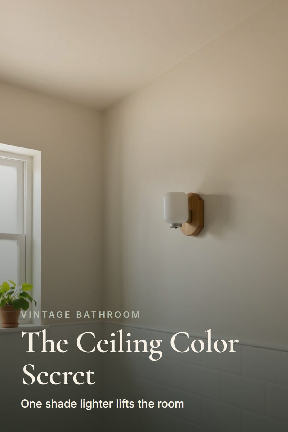
The fix is quiet: paint the ceiling a shade lighter than the walls, in the same family. It bounces the light down, makes the room feel taller, and softens the corner where wall meets ceiling. I do it in every bathroom now.
Use a paint made for bathrooms and a flat or matte finish, so the ceiling doesn't glare back at you. Ceilings catch the most steam, so this is the one place where mildew-resistant paint truly earns its keep.
Which finish to use on walls and trim
Finish matters as much as color in a room that steams. My default is eggshell on the walls: it wipes clean, hides roller marks, and is forgiving over the slightly wavy plaster you find in old houses. Satin is the better call if the bathroom gets daily long showers.
Trim, doors and window casings get semi-gloss. It's tougher, it handles splashes, and the sheen reads as a deliberate frame around the tile. Flat paint is lovely in a bedroom and a poor choice here, because every drip leaves a mark.
Prep decides how long it lasts. Wash the walls with a mild cleaner, let them dry fully, and prime anything glossy or stained. If the house is older than 1978, the existing paint may contain lead, so have it tested before you sand or scrape. The EPA's lead page explains how to find a certified tester.
How to test a color in the bathroom's own light
A swatch the size of a playing card tells you almost nothing. Buy a sample pot, or two, and paint a patch about two feet square on the wall. Tape it right beside the tile, since that's the comparison that counts.
Then look at it three times: in the morning, in the middle of the day and in the evening with the lights on. Bathroom bulbs matter here. A 2700K bulb warms everything, and a cool bulb makes a good color look dull. If you haven't settled on fixtures yet, vintage bathroom lighting covers sconces and the right bulb.
Give it a full day before you decide. Colors you love in the first hour sometimes bore you by the second, and ones that startle you at first often settle in beautifully.
When the paint and the tile still fight
Sometimes you paint, step back, and something is off. Before you reach for another can, run through this.
- Stark white walls beside warm tile. The tile turns muddy and the white turns harsh. Switch to a warm white with cream in it.
- Walls the same temperature as the tile. Blue beside blue, or pink beside pink, with no relief. Warm it up, or deepen it.
- A swatch chosen under store lights. Judge color at home, beside the tile, in your own bulbs.
- Flat paint on bathroom walls. It stains and scuffs fast. Repaint in eggshell or satin.
- A ceiling in the same color as the walls. It feels heavy. Go a shade lighter.
One more warning from experience. I'd think hard before painting original tile itself. The glaze is part of what makes it valuable, and it's very hard to restore once it's covered.
A checklist before you buy a can
- Clean the tile, then hold white paper against it to find the undertone.
- Decide whether the wall will match quietly or go deeper.
- Pick a color family: warm white, mushroom, putty, sage, ink blue, burgundy or soft clay.
- Paint a two-foot sample beside the tile, and check it at three times of day.
- Choose eggshell or satin for the walls and semi-gloss for the trim.
- Paint the ceiling one shade lighter, in a bathroom-rated paint.
- Test old paint for lead before you sand, and confirm the fan runs 20 minutes after a shower.
Take your time with this one. The tile will outlast the paint by decades, and a good wall color is the quickest way to make old tile look chosen. If you want the wider picture for the whole room, the complete guide to a vintage bathroom pulls every decision together.
The Vintage Bathroom Paint Pairing Sheet
The printable is being finished. It will live here, free, with no sign-up wall.
Frequently asked
What paint finish is best for a vintage bathroom?
Should bathroom walls match the tile?
Can I use a dark color in a bathroom with old tile?
Should the ceiling be white?
Sarah Whitmore
she keeps the teak, she oils it in spring
Sarah has furnished the same porch three times and finally stopped. She writes about what actually survives a decade outdoors — which wood silvers, which fabric fades, and which inexpensive piece quietly reads the same as the expensive one.
SarahMore from this corner
 Vintage Bathroom
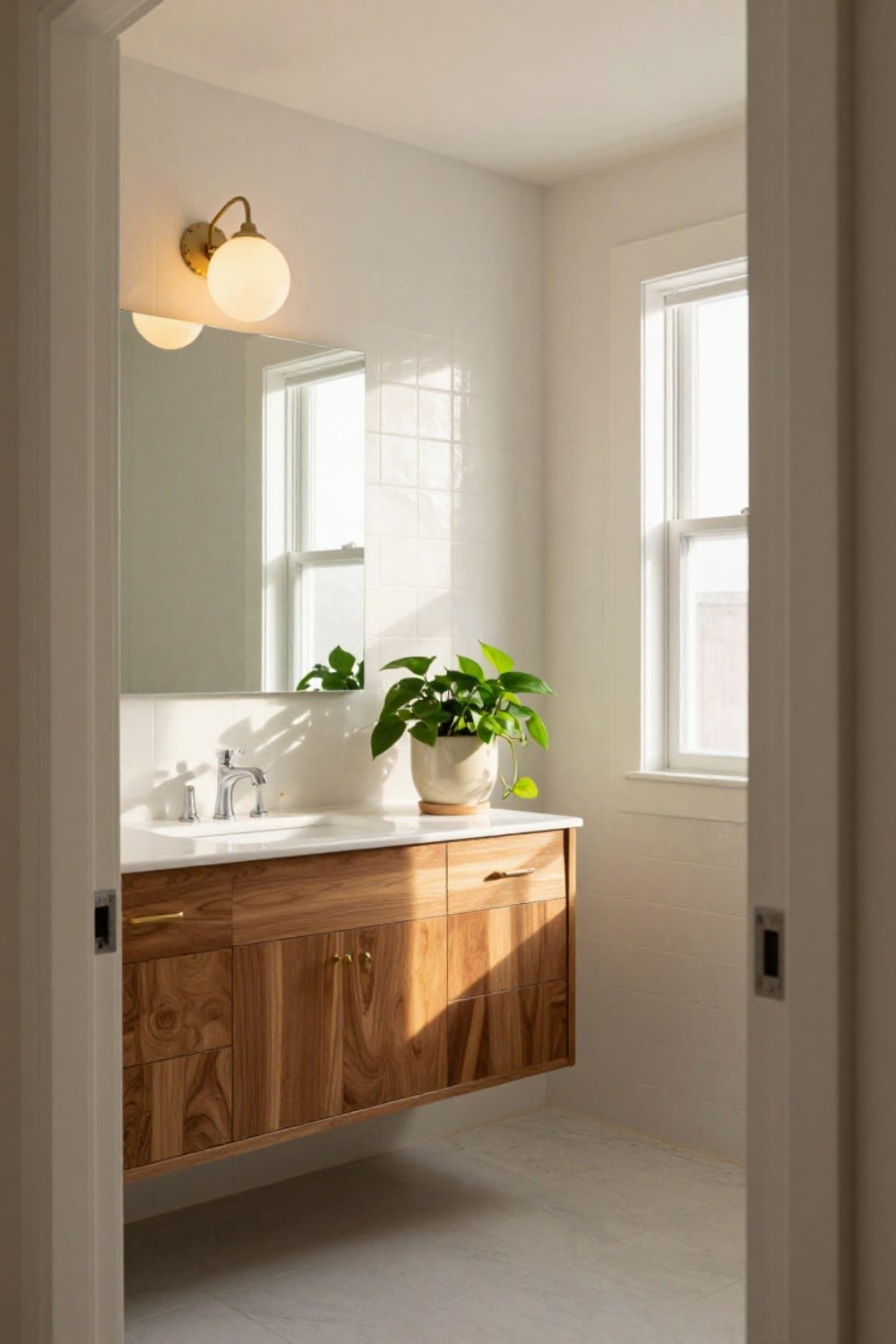
Mid Century Bathroom Ideas for a House Built in the 1950s and 60s
Mid century bathroom ideas for a ranch or split-level: the floating vanity, square and penny tile, globe lights, a wide mirror, and which original features to keep and update around.
Oct 31, 2026 · 12 min read
 Vintage Bathroom
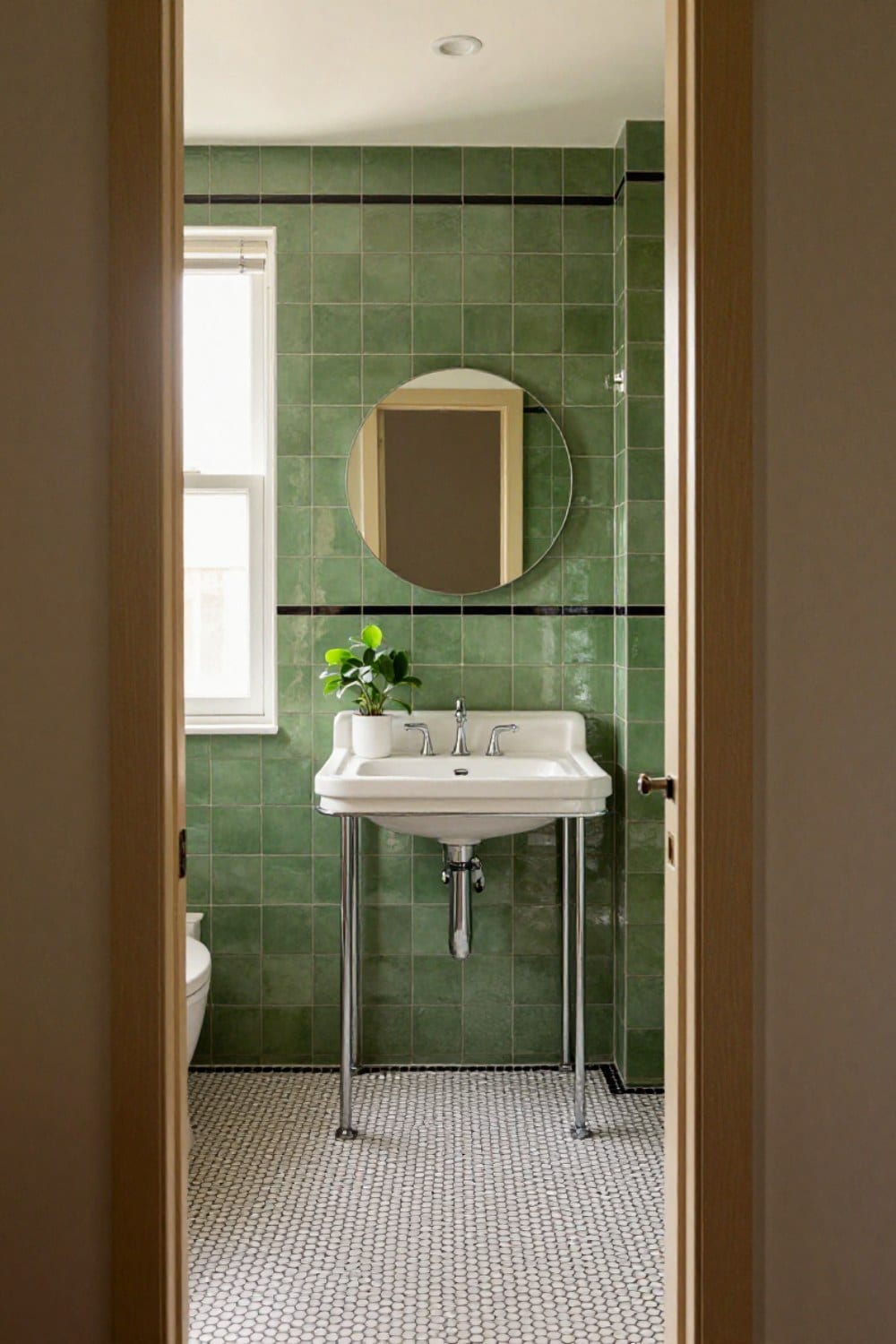
Art Deco Bathroom Ideas That Feel Classic, Not Costume
Art deco bathroom ideas scaled for a real house: the one-statement rule, black and white or green and black tile with a border, round mirrors, frosted sconces, a console sink on chrome legs, and the mistakes that make it look like a set.
Oct 31, 2026 · 11 min read
 Vintage Bathroom
 Tile Ideas: The Patterns and Colors That Never Date
Vintage bathroom tile ideas that still look right decades on: the hex, penny, subway and checkerboard patterns, the glaze colors worth keeping, the grout rule that matters most, and how to decide between repair and reproduction.
Oct 29, 2026 · 12 min read