What Color Walls Go With Green Bedding? Six Pairings That Work
Six wall colors that make green bedding look chosen on purpose: warm white, greige, soft plaster pink, taupe, pale sage and deep chocolate or charcoal. Each one comes with the green it suits, how your light changes it, and the wood that ties it together.

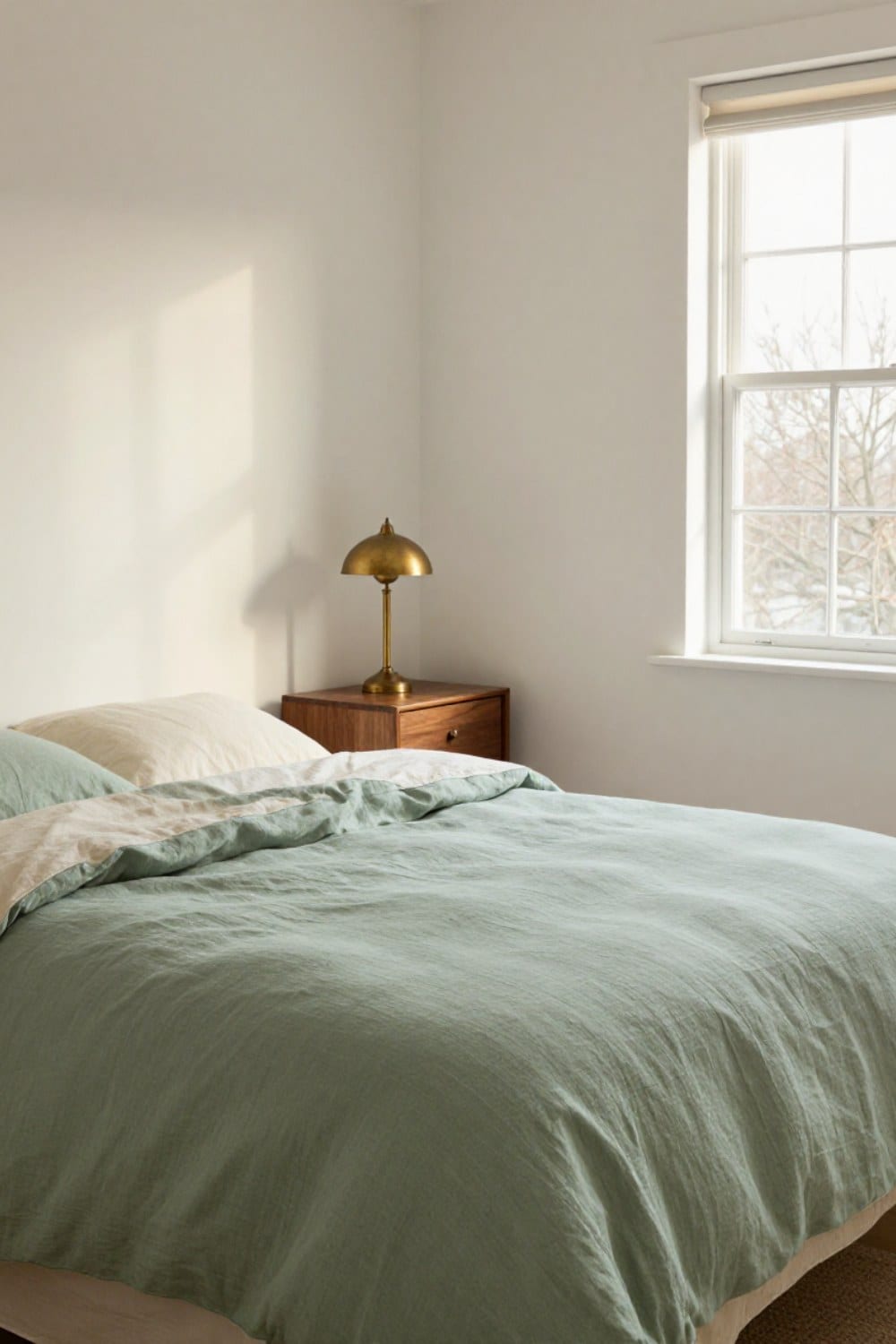
Green bedding looks easy until you hold it up to a wall. Then the sage turns gray, or the olive goes muddy, and the calm room you pictured never shows up. What color walls go with green bedding comes down to one thing you can check before you ever open a paint can: the undertone hiding inside the green you already own.
I got this wrong in our guest room. I painted a crisp, slightly blue white behind a yellow-leaning olive duvet and the whole bed looked like it had a water stain. We repainted in March. This post is the shortcut, six pairings that work and the reasons they work, so you can skip my first coat.
Everything below assumes the bedding comes first, because it's the part you touch every day. If you're still choosing the green itself, olive green bedding ideas is the place to start. Come back here once the bed is sorted and the walls are the open question.
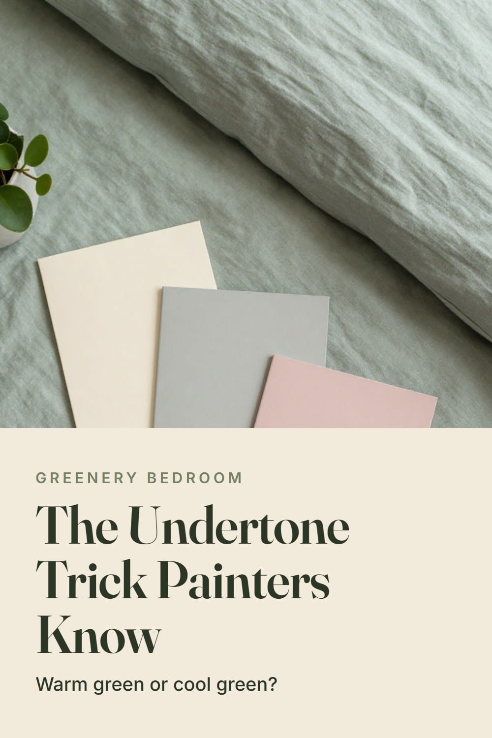
What color walls go with green bedding? Check the undertone first
Green is the trickiest bedding color because it sits on a fence. Olive, moss and most natural linen greens lean yellow. Eucalyptus, many sages and forest lean toward blue or gray. A wall that shares your green's undertone looks planned. A wall that fights it looks like a mismatch, even when both colors are technically neutral.
Here's the test I use. Lay a sheet of plain white printer paper beside your duvet in daylight. Does the green look warmer next to the paper, a little butter in it? Or cooler, a little smoke? Do the same with a paint sample and compare your two answers. Matching answers means an easy pairing. Opposite answers means you're in drama territory, which can be lovely, but only on purpose.
Fabric matters too. Linen is flax, so it carries a faint gray cast and gets lighter in strong sun. Velvet drinks light and looks deeper than the same color in cotton. The six pairings below run from safest to boldest.
1. Warm white walls
If you only read one section, make it this one. A warm white, the kind with a drop of cream or butter in it, works behind every green I've ever put on a bed. It lets sage look fresh, olive look sun-warmed and forest look like it belongs in a library.
Skip anything labeled bright or brilliant white. Those lean blue, and blue-leaning white next to yellow-green is exactly what gave my olive duvet its water-stain look. You want a white that looks slightly soft in the can, almost like the inside of an eggshell.
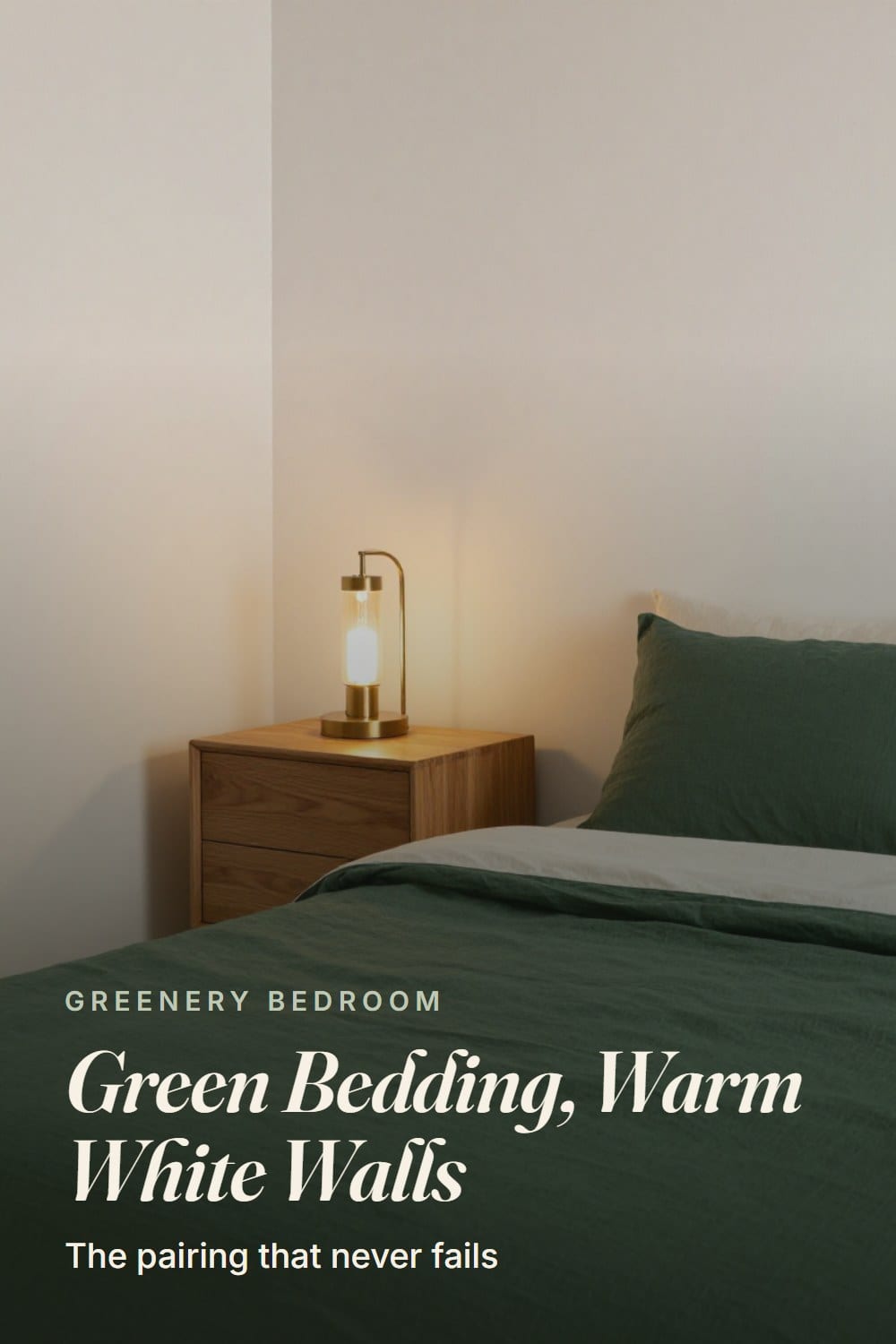
Best with: all three. Sage gets airy, olive gets golden and forest gets crisp contrast. Wood that bridges: oak, ash and pale walnut keep the room light, while a dark walnut frame gives forest bedding something to sit against.
Light check: warm white is forgiving in every exposure, but a north room will pull it toward gray on cloudy days. If that's your room, pick the creamier of two samples.
2. Greige walls
Greige is gray and beige in one, and its job is to stay out of the way. It's the right choice when your bedding already has plenty to say, say a deep forest duvet with a ruched Euro sham, and you want the walls to hold the room together without competing.
The catch is undertone again. A greige that leans pink-beige looks flat beside sage. A greige with a hint of green or olive in its gray feels related to the bedding, and that's the one to hunt for. Hold your paper trick up to it: the greige should look slightly warmer than the paper, never cooler.
Best with: sage and forest. With olive it can go a little muddy unless the greige is clearly warm. Wood that bridges: mid-tone oak and walnut, and a little aged brass on a lamp base catches the warmth in both.
Light check: south and west light make greige look golden and pleasant. In a north room it can read as concrete, so add a lamp at 2700K and skip the cool white bulbs.
3. Soft plaster pink walls
This is the pairing people laugh at until they see it. I did. Then a friend repainted her primary bedroom a muted, clay-leaning pink, the color of dry lime plaster, and put her sage linen duvet on the bed. I stood in the doorway for a full minute.
Pink and green sit nearly opposite on the color wheel, which is why they look so comfortable together. They make each other richer. The word that matters is plaster. You want dusty, slightly brown-leaning pink, the shade of old terracotta washed out by the sun, not candy and not a baby's room.
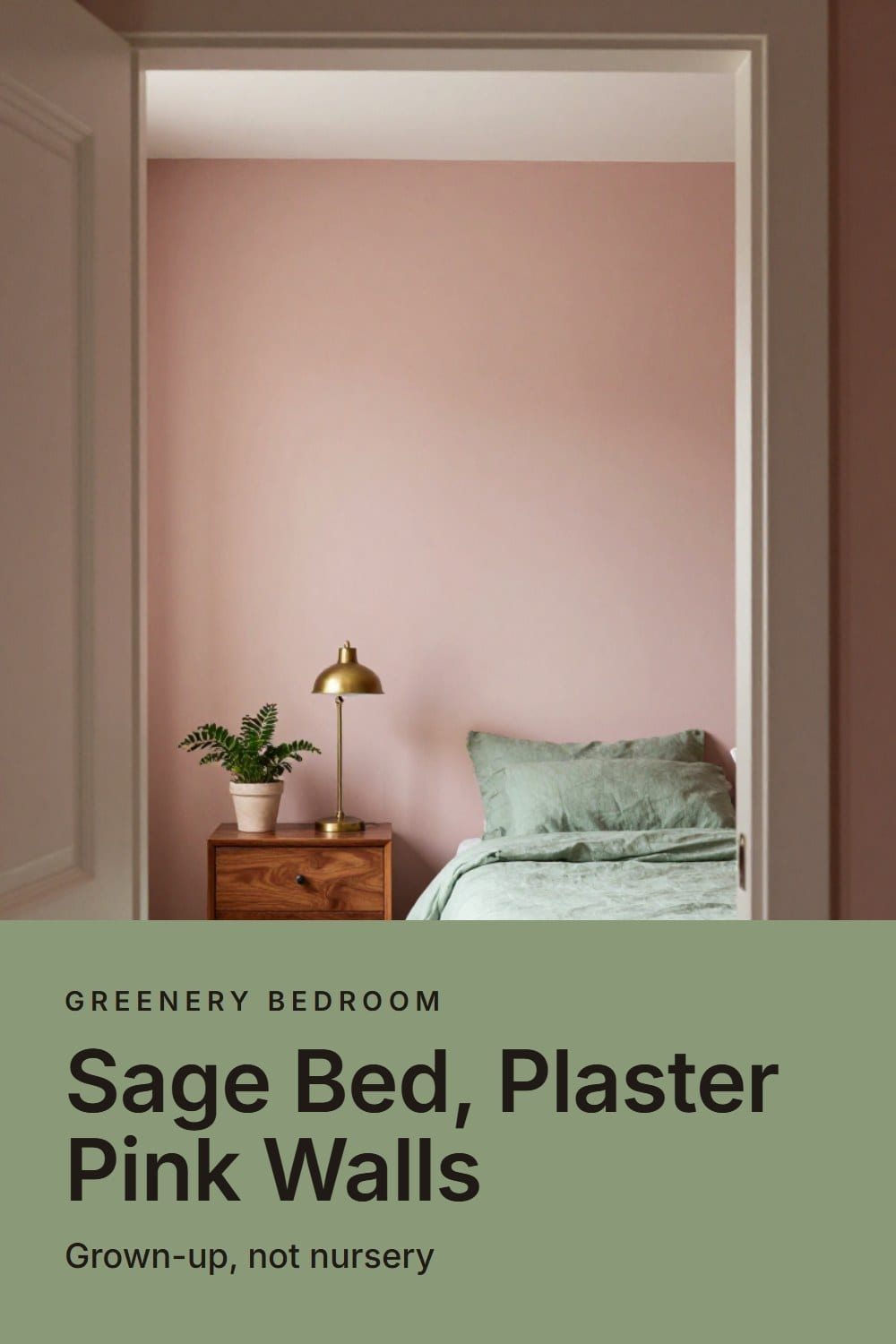
Best with: sage most of all, and olive when the pink has a little orange in it. Forest also works, and gets very Italian hotel. Wood that bridges: walnut and cherry. Their red undertones sit happily between the pink and the green.
Light check: pink is the color that changes the most. East light makes it glow in the morning. North light can make it gray out. Test it on two walls, not one.
4. Taupe walls
Taupe is deeper than greige and a little browner, the color of a suede glove. On a bedroom wall it feels like a good coat: quiet, a bit expensive, and happy to be photographed with anything.
It's my pick for olive and forest bedding specifically, because the brown in the taupe picks up the yellow in the green. A moss-green velvet headboard against taupe walls is one of the calmest combinations I know. If you're considering one, green velvet headboard ideas shows how that pairing finishes a bedroom.
Best with: olive and forest. Sage can look a little weak against a strong taupe, so keep the sage on the lighter side if you go this way. Wood that bridges: walnut, dark oak and aged brass hardware.
Light check: taupe loves a west window, where evening sun turns it amber. In a dim room, choose a lighter taupe than you think you want. It always dries darker on the wall.
5. Pale sage, tone on tone
Walls a few steps paler than the bedding, in the same family. It sounds too matchy, and it isn't, as long as the bedding is clearly deeper than the wall. The effect is a room that feels like one slow exhale.
Mixed textures keep it from going flat. Put a linen duvet against a matte wall, add a velvet pillow in a deeper green, and let a white percale sheet show at the fold. Percale is a one-over-one-under cotton weave, crisp and matte, and its clean white gives the eye somewhere to rest. For more on picking the wall shade itself, the sage green bedroom ideas post goes deeper into walls and palette.
Best with: sage, naturally, and eucalyptus-leaning greens. Wood that bridges: pale oak, ash and bleached walnut, which keep it airy. If you want a clear paint recommendation, the best sage green paint colors for a bedroom is the post to open.
Light check: pale green walls pick up whatever sits outside the window. Big trees mean the wall glows a little greener, and a brick wall across the street warms it. Look at it on a gray December afternoon before you decide.
6. Deep chocolate or charcoal for drama
This is the one that makes people nervous, and I understand it. Dark walls can make a bedroom feel like a hug or like a basement. What decides is your light and your finish.
A deep chocolate brown behind olive or forest bedding is rich in a way white never manages. Charcoal with a trace of green in it does the same thing for sage, cooler and more modern. Either one wants a matte finish, because a glossy dark wall shows every roller mark and every shadow.
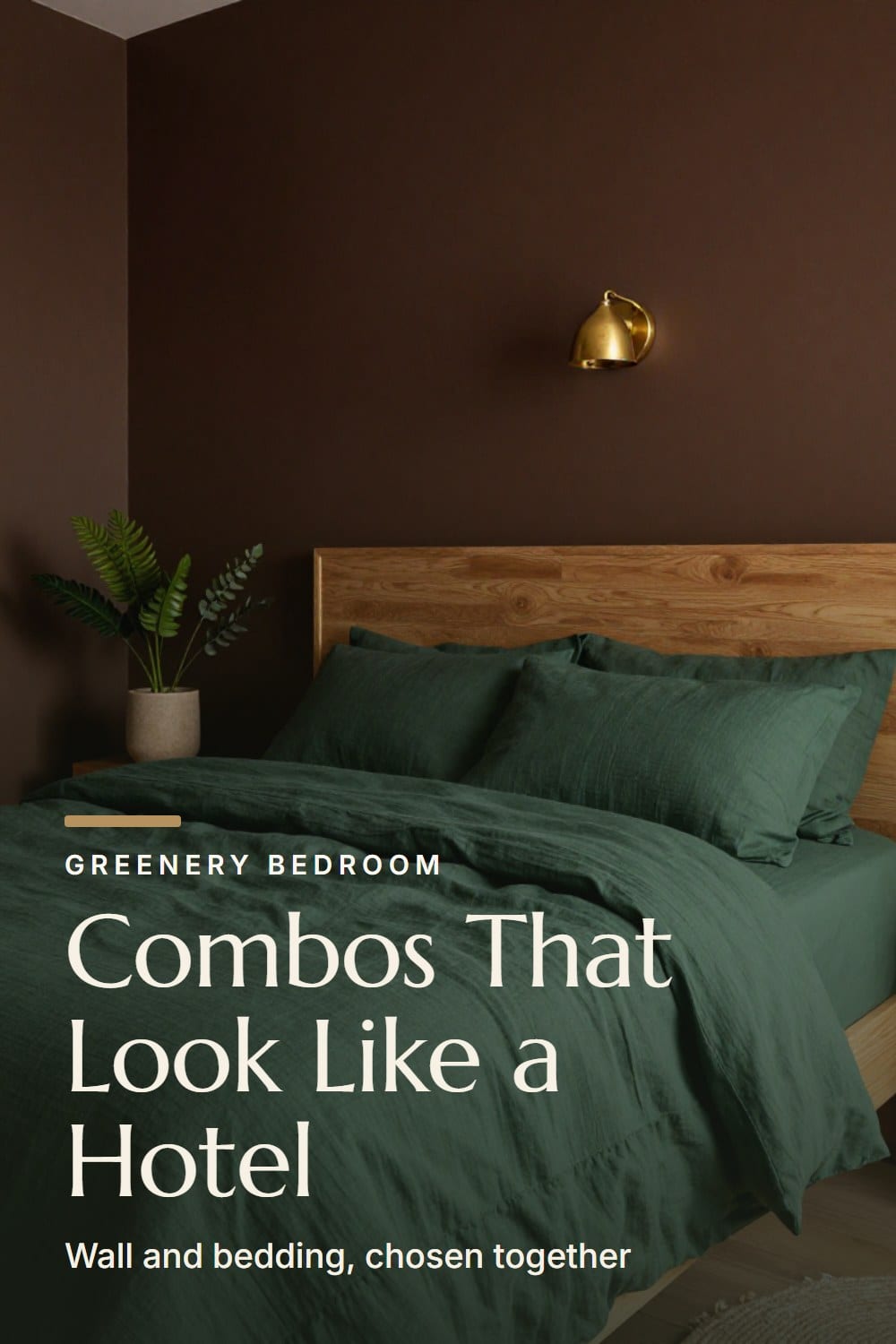
Best with: forest and olive for chocolate, sage and forest for charcoal. Wood that bridges: honey oak and warm walnut, plus brass, because dark paint needs warmth to push back against it.
Light check: a room with two windows or a south exposure carries dark paint easily. A north room with one window will look sleepy at noon, though at night, with a 2700K lamp on, it will feel wonderful. Only choose it if you mostly use the room in the evening.
How light direction changes every one of these
Paint chips are lit by a store. Your walls are lit by your actual windows, and the difference is bigger than most people expect. Same wall color, four different rooms.
- North light is cool and steady. It pulls warm whites toward gray and makes pink and taupe look flatter. Choose the warmer sample.
- South light is bright and warm all day. Almost everything looks good, and pale sage can wash out, so go a notch deeper.
- East light is golden and gentle in the morning, then cool by afternoon. Good for pink and warm white.
- West light is dim until late, then orange. It flatters taupe, chocolate and greige, and can make pale sage look a little yellow at dusk.
Winter shifts all of it. A low December sun reaches deeper into the room but a gray sky takes the warmth right out of a wall. That's why I test samples in the cold months even when I'm painting in spring. If the color holds up on a flat gray afternoon, it will hold up the rest of the year.
Wood tones that tie the wall and the bed together
Wood is the translator in a bedroom. The bed frame, nightstands and dresser sit between the wall and the bedding, so their undertone can calm the whole thing down.
Honey and golden oak love olive and taupe. Pale ash and bleached oak suit sage and warm white. Walnut, with its red-brown depth, works with nearly all of it and is the most forgiving of the lot. Orange-y pine is the hardest. If you own it, lean on a warm white wall and let the wood be the warm note.
Metal does the same job in a smaller way. Aged brass warms any green, and chrome next to olive tends to look cold.
If your green bedding already clashes with the walls
You may be reading this after the fact, with the paint on and the duvet looking wrong. You have more options than repainting.
First, find the bridge. If your walls are warm and the green is cool, add one warm element that touches both, like a caramel throw or a brass lamp. If it's the other way around, a gray-green pillow can pull the bed toward the wall. Second, change the layer closest to the wall: the Euro shams, at 26 by 26 inches, are the biggest block of color behind your head. How to layer bedding like a designer walks through swapping those so the bed softens without losing the green.
Third, change the sheets. A white or oatmeal flat sheet at the fold, or a linen in a neutral tone, gives the eye a pause between wall and duvet. And if the green itself is the problem, the best green linen duvet covers compares sage, olive and forest options so you can swap toward a better match.
A paint and bedding matching checklist
Before you buy a gallon, run through this. It takes a weekend, and it saves a repaint.
- Hold plain white paper beside your bedding in daylight and decide if the green reads warm or cool.
- Pick two or three samples that share that answer, then paint each on a 2 by 2 foot board or a patch on the wall.
- Check them at 8 a.m., at 2 p.m. and at night under your real 2700K lamplight.
- Set the actual duvet or a folded corner of it against the sample, not a swatch.
- Look at the wood, metal and rug in the same glance, and ask whether the undertone sits well beside them.
- Live with the patch for three days before you decide.
A chip is a guess. A patch in your own light is an answer. For a cold-month take on how velvet changes the picture, olive velvet bedding for winter is worth a look, and olive green bedroom ideas covers the room itself when olive is your color.
The Green Bed and Wall Pairing Card
The printable is being finished. It will live here, free, with no sign-up wall.
Frequently asked
What color walls go best with sage green bedding?
Can I use gray walls with olive green bedding?
Should my walls be lighter or darker than my green bedding?
How many wall samples should I test?
Sarah Whitmore
she keeps the teak, she oils it in spring
Sarah has furnished the same porch three times and finally stopped. She writes about what actually survives a decade outdoors — which wood silvers, which fabric fades, and which inexpensive piece quietly reads the same as the expensive one.
SarahMore from this corner
 Bedroom Sanctuary
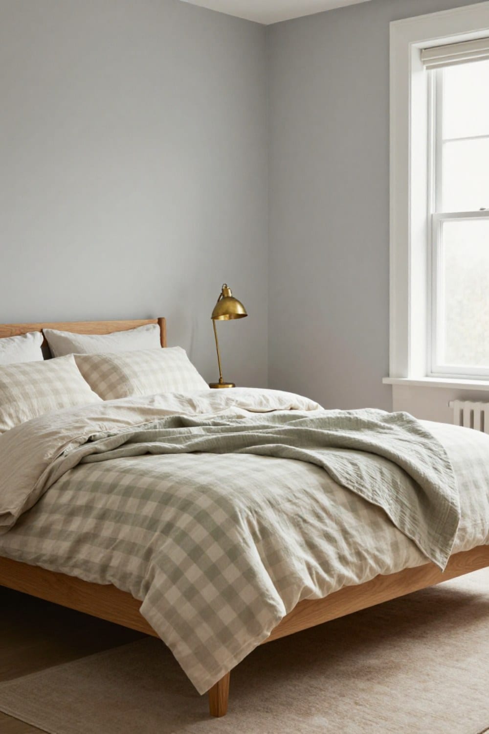
Green Gingham Bedding: How to Style It So It Looks Grown-Up
Green gingham bedding can look calm and collected instead of nursery. Here is how to choose the check size, keep it to one layer, mix it with other patterns and pair it with wood so the bed looks grown-up.
Oct 25, 2026 · 10 min read
 Bedroom Sanctuary
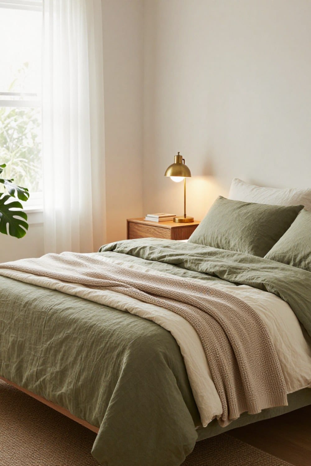
Olive Green Bedding Ideas: How to Make a Green Bed Look Collected
Olive green bedding ideas that make a bed look collected instead of matched: the three-tone rule, the fabrics that read expensive in green, what goes on top, and what belongs on the walls behind it.
Oct 22, 2026 · 11 min read
 Bedroom Sanctuary
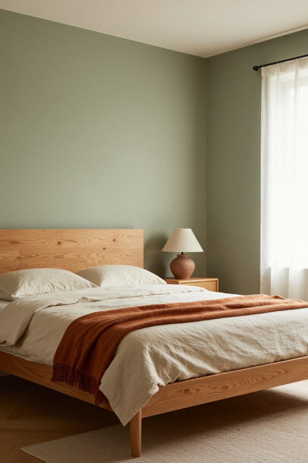
Sage Green and Terracotta Bedroom: A Warm Palette That Works With Wood
Sage green and terracotta is the easiest earthy palette to live with, as long as you get the proportions, the wood and the lightbulb right. Here is how I split it, where the clay goes, and what to swap each season.
Oct 20, 2026 · 10 min read